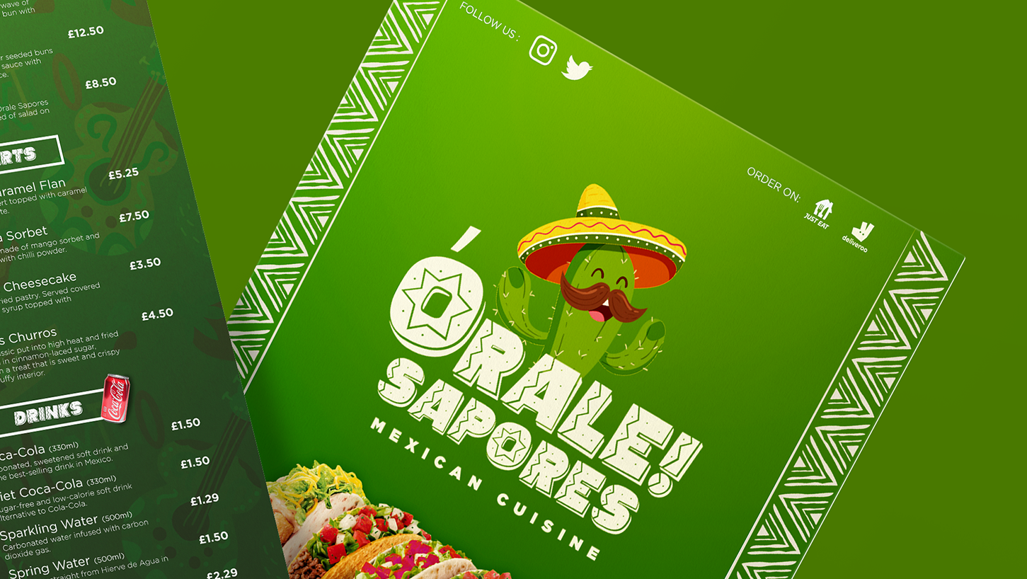
this university brief entailed me to create an e-commerce website from beginning to finish. i did extensive research looking at big e-commerce platforms to gain a better understanding of how the website should look and how it should function. some of the e-commerce websites I used were shopto, amazon, Argos, base.com and currys pc world.
the target audience for tabletsoutlet were technology consumers for the most part since it offers a range of different items for people to buy. some of the items it sells are tablets as the name says, desktops, gaming consoles, mobile phones, laptops and headphones.
after GAINING KNOWLEDGE FROM THE EXTENSIVE RESEARCH I CONDUCTED AND DECIDING THE TARGET AUDIENCE FOR THE WEBSITE. I DESIGNED A SITEMAP OF HOW THE WEBSITE OPERATES, SHOWING THE USER JOUNERY FROM WHEN THEY FIRST CLICK ON THE WEBSITE AND WHAT EACH LINK LEADS TO.
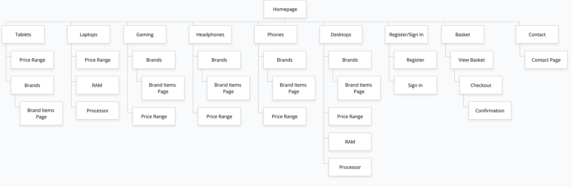
( Sitemap of tabletsoutlet )
After completing the sitemap, i moved onto the wireframing of tabletsoutlet, designing the homepage, the registration and login page as well as the Lenovo brand page for laptops. below are the wireframes for these three pages. the homepage features a lot of different advertisements promoting offers on the website right now such as on Nintendo games, tech in demand which is going fast and super popular items on sale. the brand page which in this case is Lenovo laptops, shows the brand logo below the menu and payment options , centred. it also features a filter list on the left hand side for easy selection of technology for the consumer and a drop down menu on the top right hand corner allowing the user to filter high to low and vice-versa as well as relevant items shown first. as for the registration and login page, it shows the fields needed to enter to be apart of the tabletsoutlet.
however, all of the pages follow the same scheme in regards to having social media, help and account management at the top, the logo, search bar , registration/login and basket below it. as well as the categories and payment options below that. the footer is another page of the remains the same on all pages.
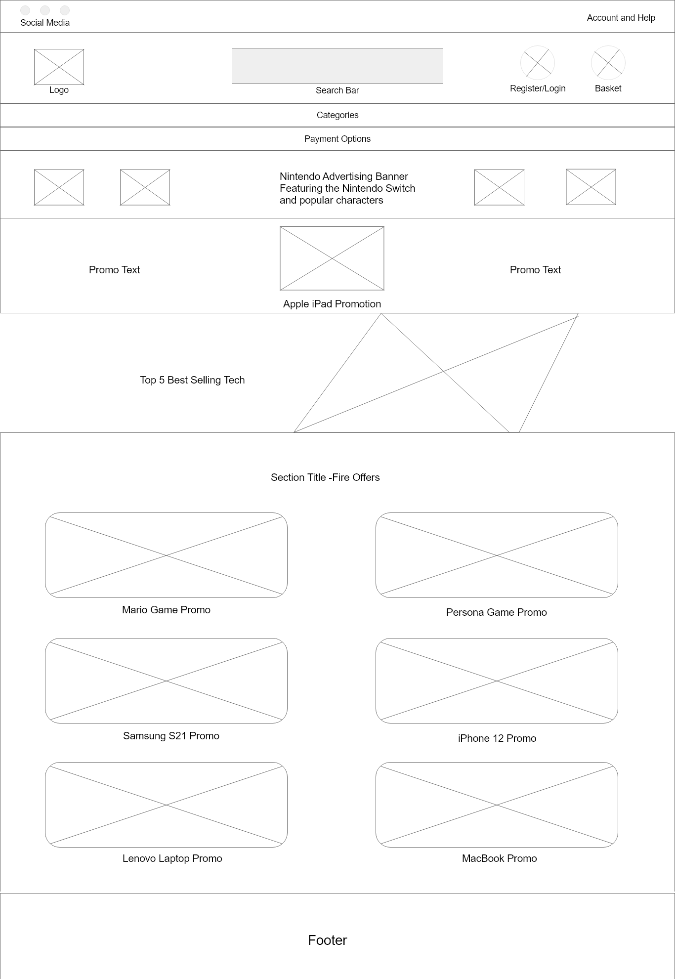
( WIREFRAME HOMEPAGE OF TABLETSOUTLET )
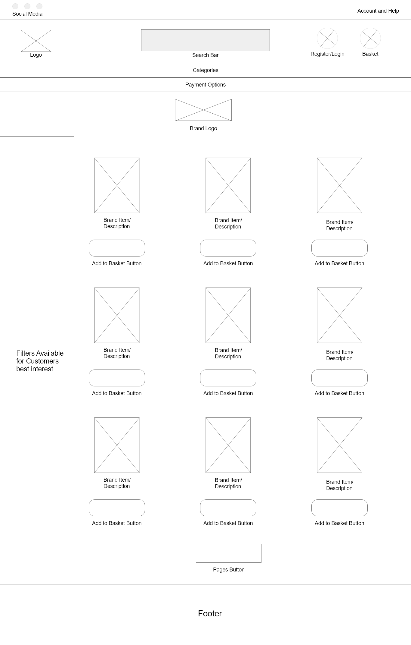
( WIREFRAME FOR LENOVO LAPTOP BRAND PAGE )
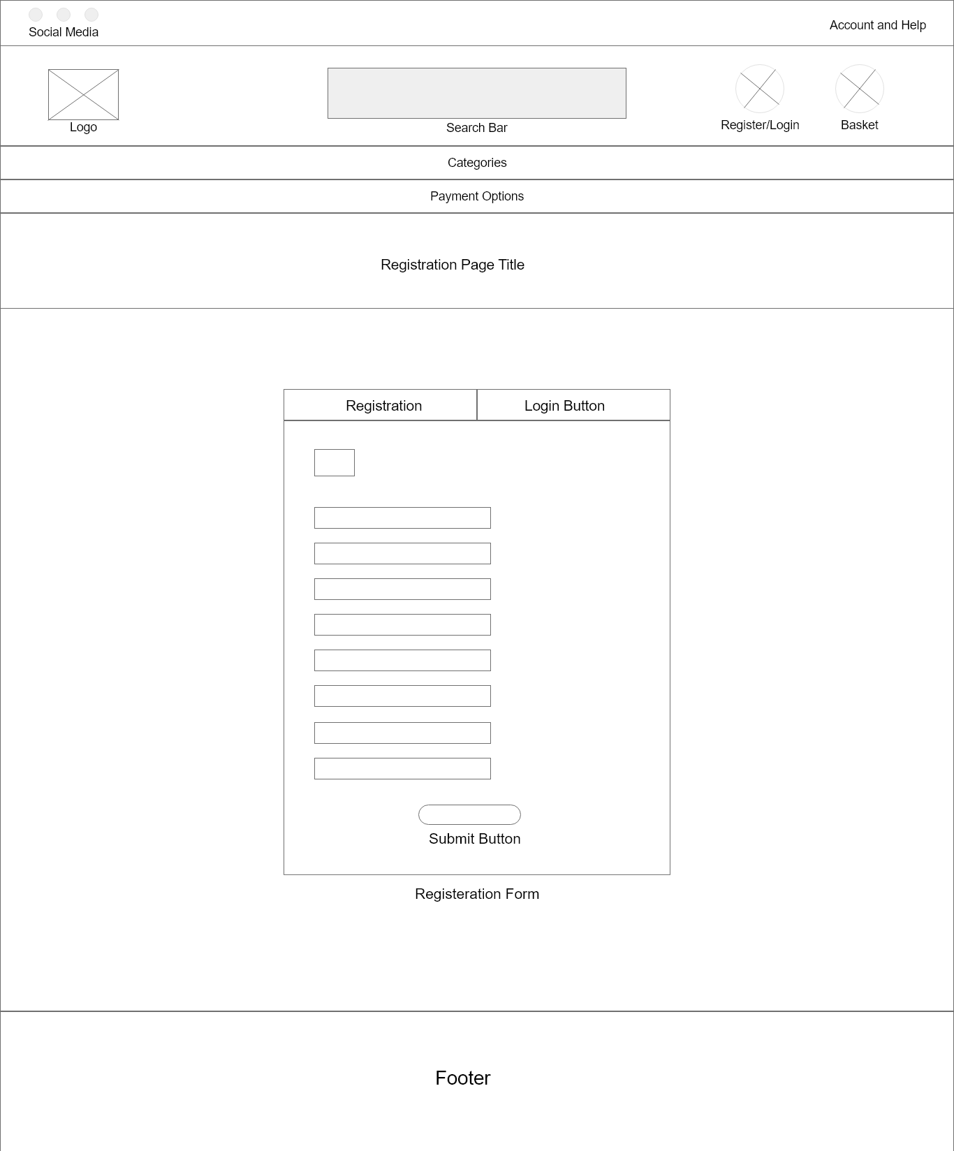
( wireframe for the registration and login page of tabletsoutlet )
oNCE I COMPLETED THE WIREFRAMING FOR TABLETSOUTLET, I MOVED ONTO THE TYPOGRAPHY AND COLOUR SCHEME OF THE WEBSITE. FOR THE FONT STYLE, I USED NEUSA next STD SINCE IT GIVES OFF AN BOLD AND TECH STYLE FEEL AND FELT IT WAS APPORIATE FOR TABLETSOUTLET. when deciding the colour scheme for tabletsoutlet, I decided to redesign the logo from the original style i had in the email design I created. THE LOGO CONSISTS OF TWO GIANT LETTERS BEING T AND O AND HAS TABLETS OUTLET BELOW IT. THE T AND TABLETS comprises OF THE COLOUR RED AND OUTLET AND O in blue.
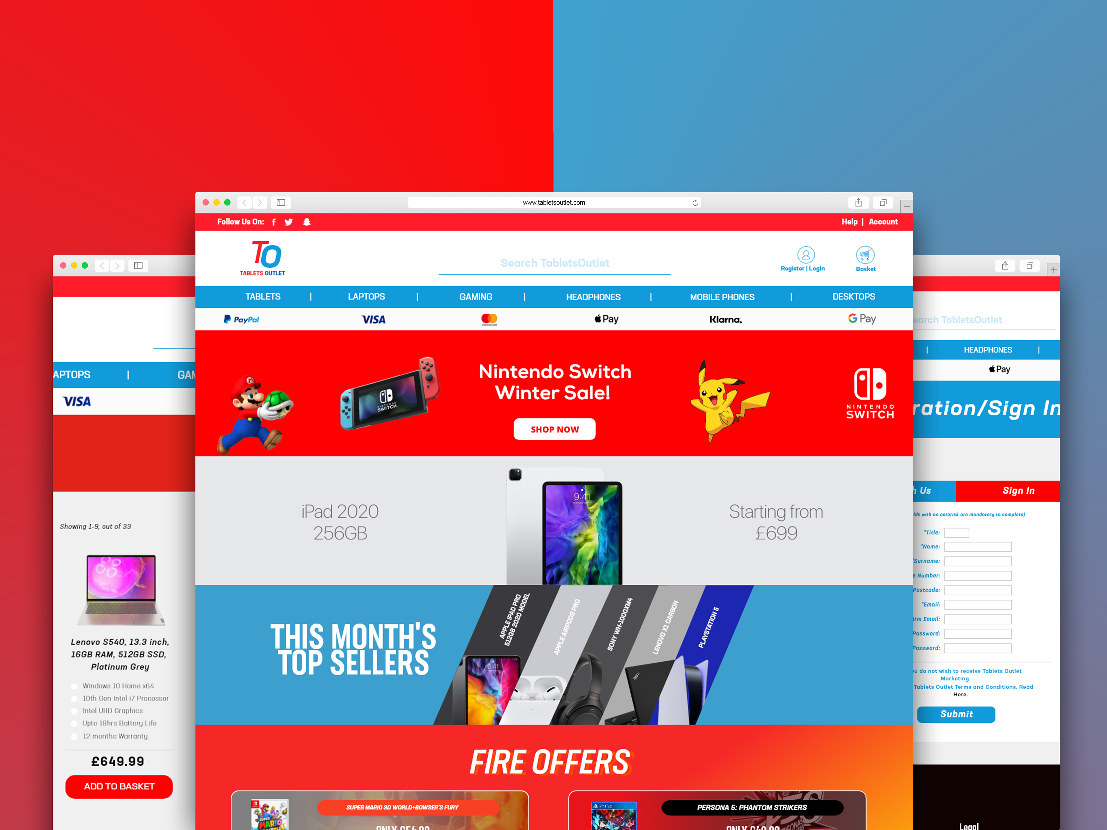
( some of tabletoutlet pages )
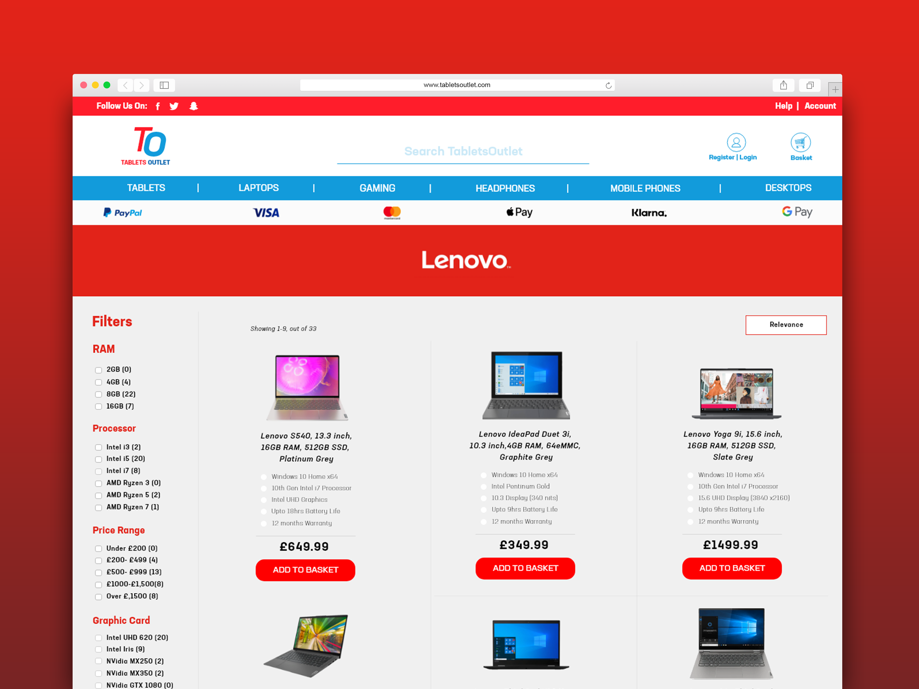
(tabletsoutlet's lenovo laptop page )
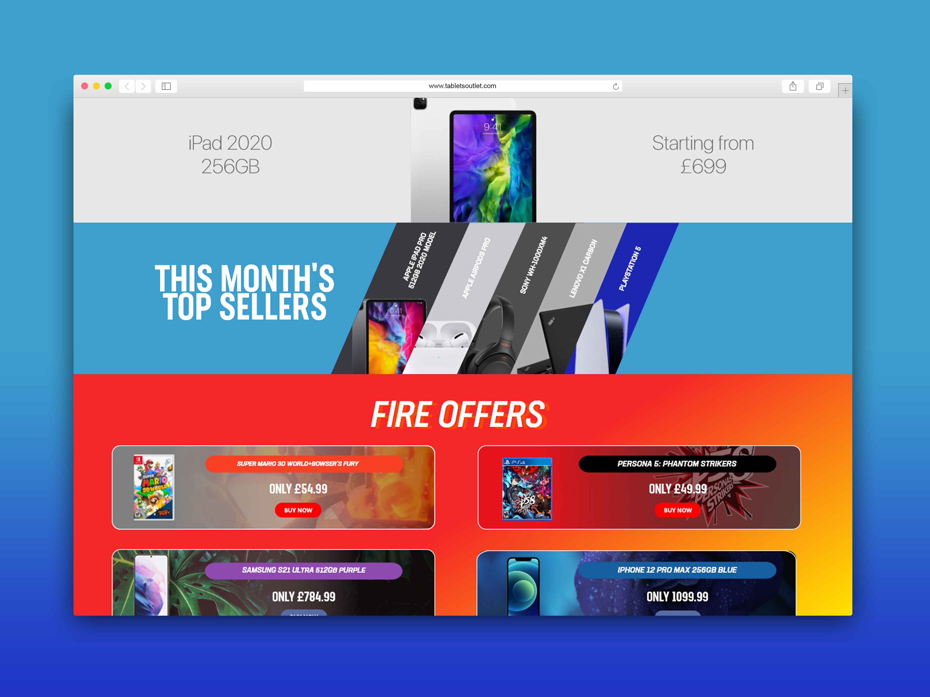
( tabletsoutlet main page )
WHEN I FINISHED WITH THE DESIGNING AND COLOUR SCHEME AS WELL AS TYPOGRAPHY. I PROTOTYPED TABLETSOUTLET TO SEE HOW IT WOULD FUNCTION AND IF THERE WAS AREAS TO IMPROVEMENT. ONCE I DID THE FIRST PROTOTYPING, I MADE FRIENDS AND FAMILY USE IT AND GIVE FEEDBACK TO FURTHER IMPROVE THE WEBSITE. THE FINAL PROTOTYPE CAN BE VIEWED BELOW.
( tabletsoutlet website prototype in 1366 x 768 display )