Project Overview
This project originated from a university brief to design a fictional book cover for a young adult audience, within the supernatural and psychological genre.
The concept explores themes of fear, uncertainty, and hope through atmosphere-driven visual storytelling.
Objective
The objective was to create a book cover that:
- Immediately builds intrigue from first glance
- Reflects the darker tone of the genre
- Appeals to young adult readers through mood, symbolism, and contrast
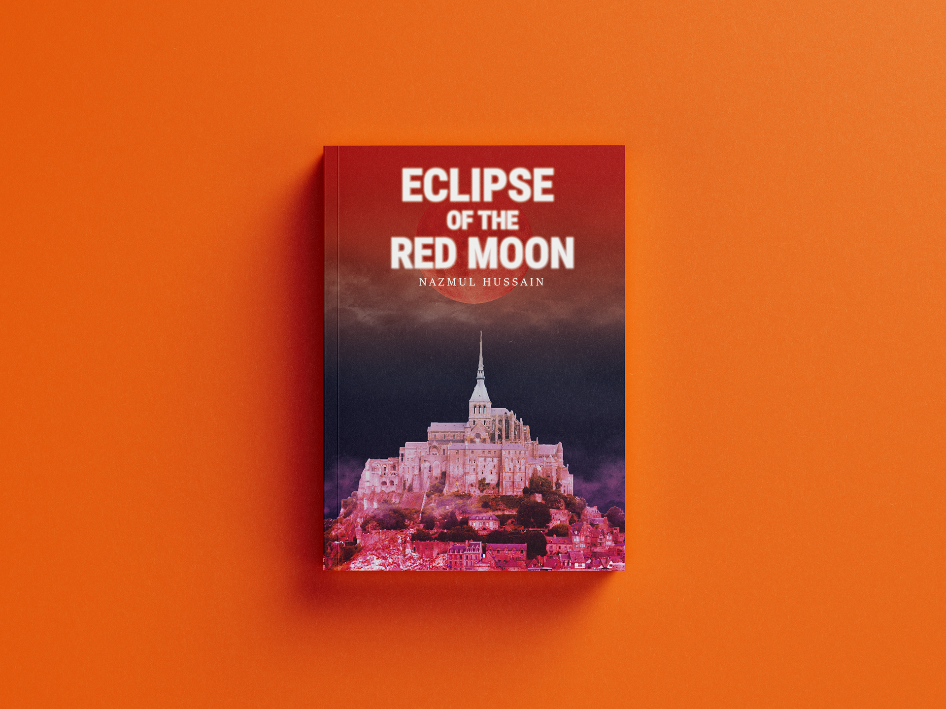
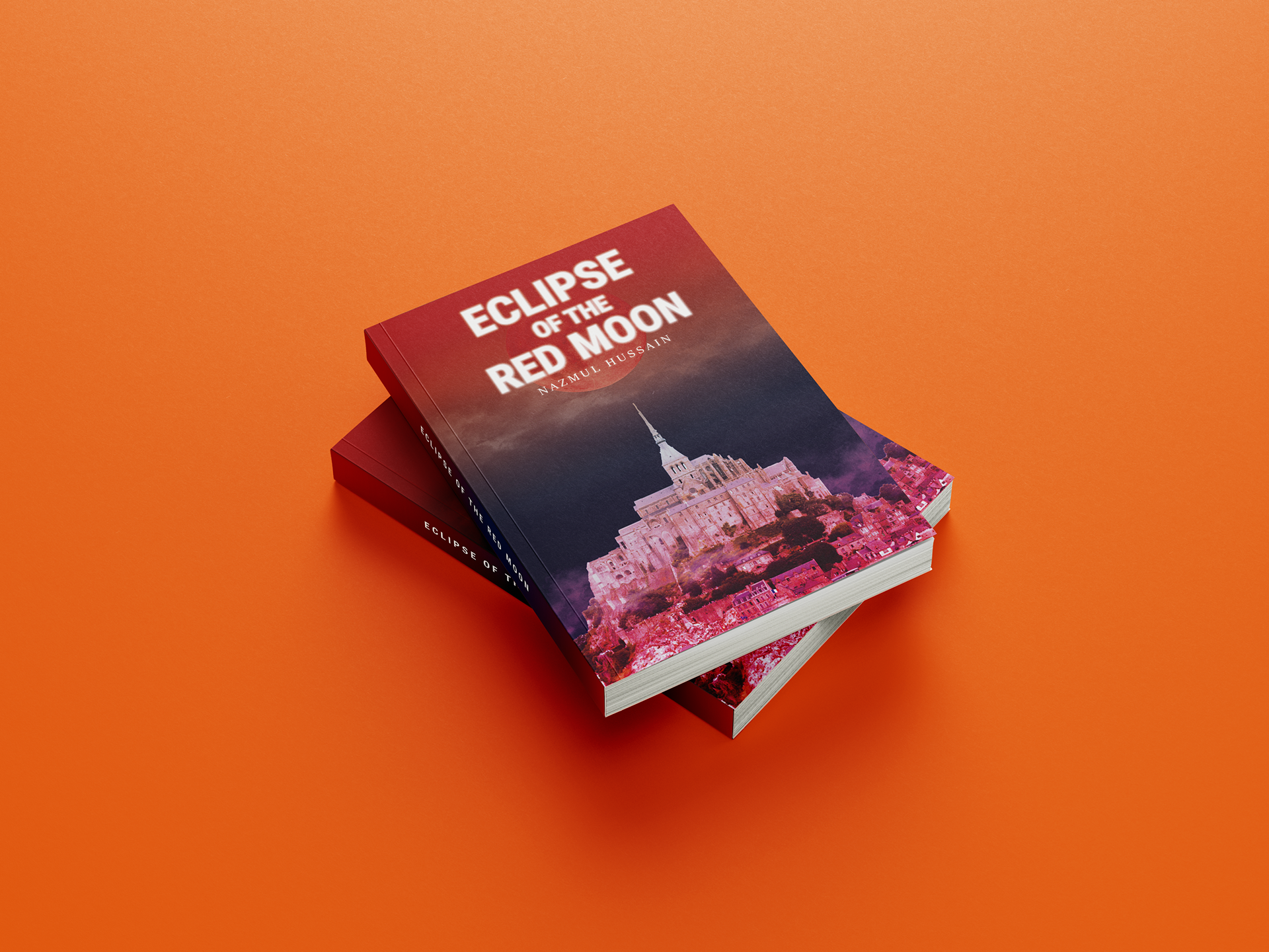
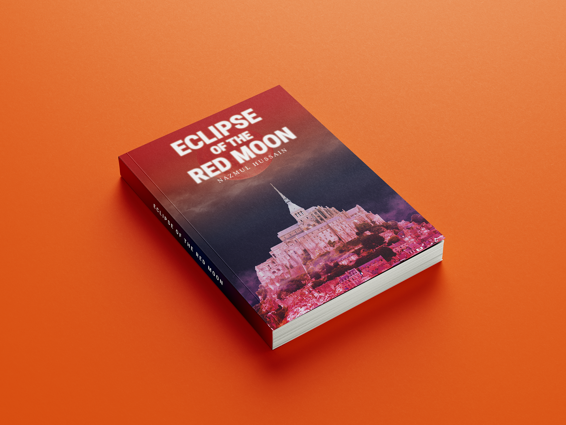
The title 'The Eclipse of the Red Moon' was chosen to suggest both a supernatural event and an impending sense of danger.
Concept & Visual Approach
The front cover is divided into two distinct visual halves to create narrative tension.
The upper half features a red moon surrounded by red mist, using colour as a symbol of danger, transformation, and unease. This establishes the supernatural threat immediately and sets an eerie tone.
The lower half depicts a city engulfed in red shadow, with only the top of a distant castle remaining untouched. This contrast is intentional, positioning the castle as a possible beacon of hope within an otherwise corrupted environment.
To enhance the sense of mystery, a subtle outer glow was applied to the title, helping it stand out while reinforcing the supernatural atmosphere.
Back Cover & Interior Design
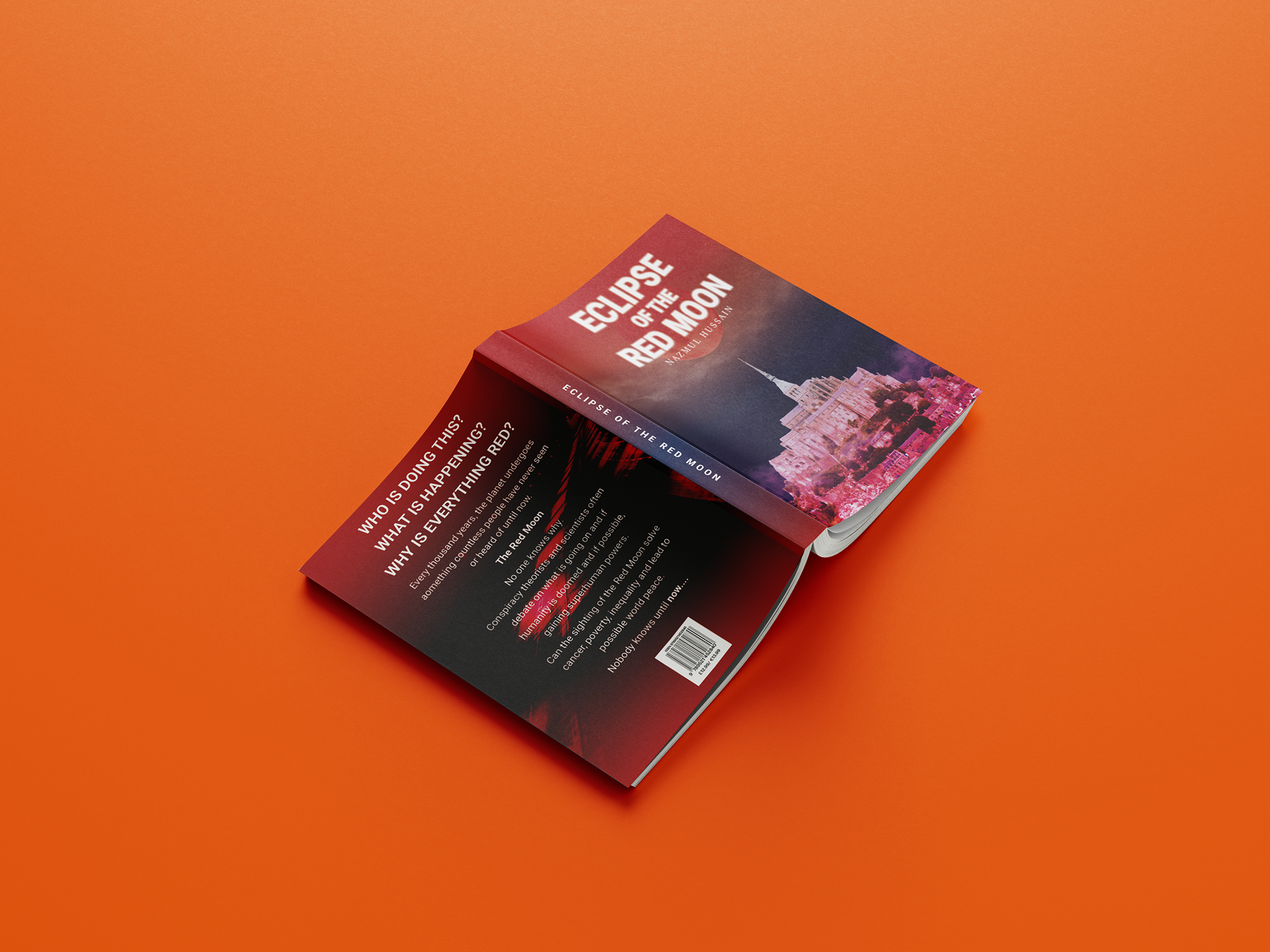
The back cover features a secluded highway, chosen to create a surreal and unsettling feeling, suggesting isolation and uncertainty. Key words within the blurb are emphasised in bold to heighten tension and draw the reader into the narrative.
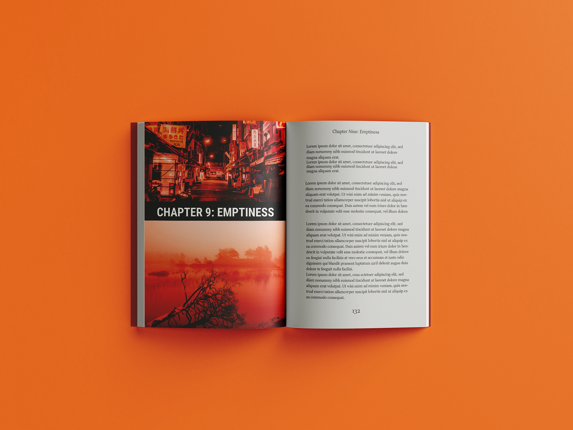
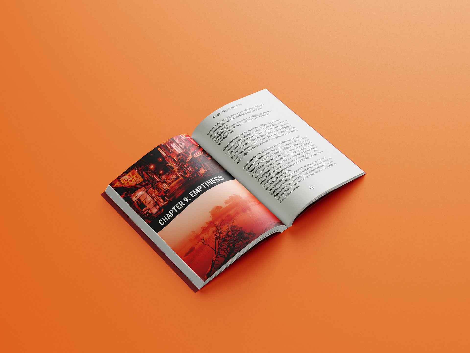
Chapter pages continue this tone through minimal, desaturated imagery that portrays a lifeless and dire world. Both the back cover and chapter visuals are enveloped in red tones and negative space to reinforce themes of emptiness and hopelessness.
To further engage the reader, a series of bold, white questions are placed on the back cover, prompting curiosity and panic around the central mystery , why the moon has turned red and cast the world into darkness.
Outcome & Learnings
Through this project, I:
- Strengthened my ability to use colour symbolism to communicate mood and narrative.
- Developed a more considered approach to visual storytelling across multiple book components.
- Explored how contrast and restraint can suggest hope within dark subject matter.
This project reinforced the importance of atmosphere and symbolism when designing for genre-driven storytelling.