Órale! Sapores Menu Design
Project Overview
Órale! Sapores is a personal project exploring the design of a promotional flyer and menu for a Mexican restaurant. The concept is aimed at fans of Mexican cuisine and people who enjoy bold, diverse flavours.
The idea came from the belief that Mexican food is often underrepresented in London despite the city’s cultural diversity. This project was an opportunity to celebrate Mexican food culture through expressive visuals, colour, and typography.
Objective
The objective was to create a visually engaging menu and flyer that:
- Highlights the vibrancy and variety of Mexican cuisine
- Feels energetic, welcoming, and full of character
- Immediately communicates flavour, warmth, and authenticity
The design needed to feel approachable while standing out from more generic restaurant branding.
Concept & Visual Approach
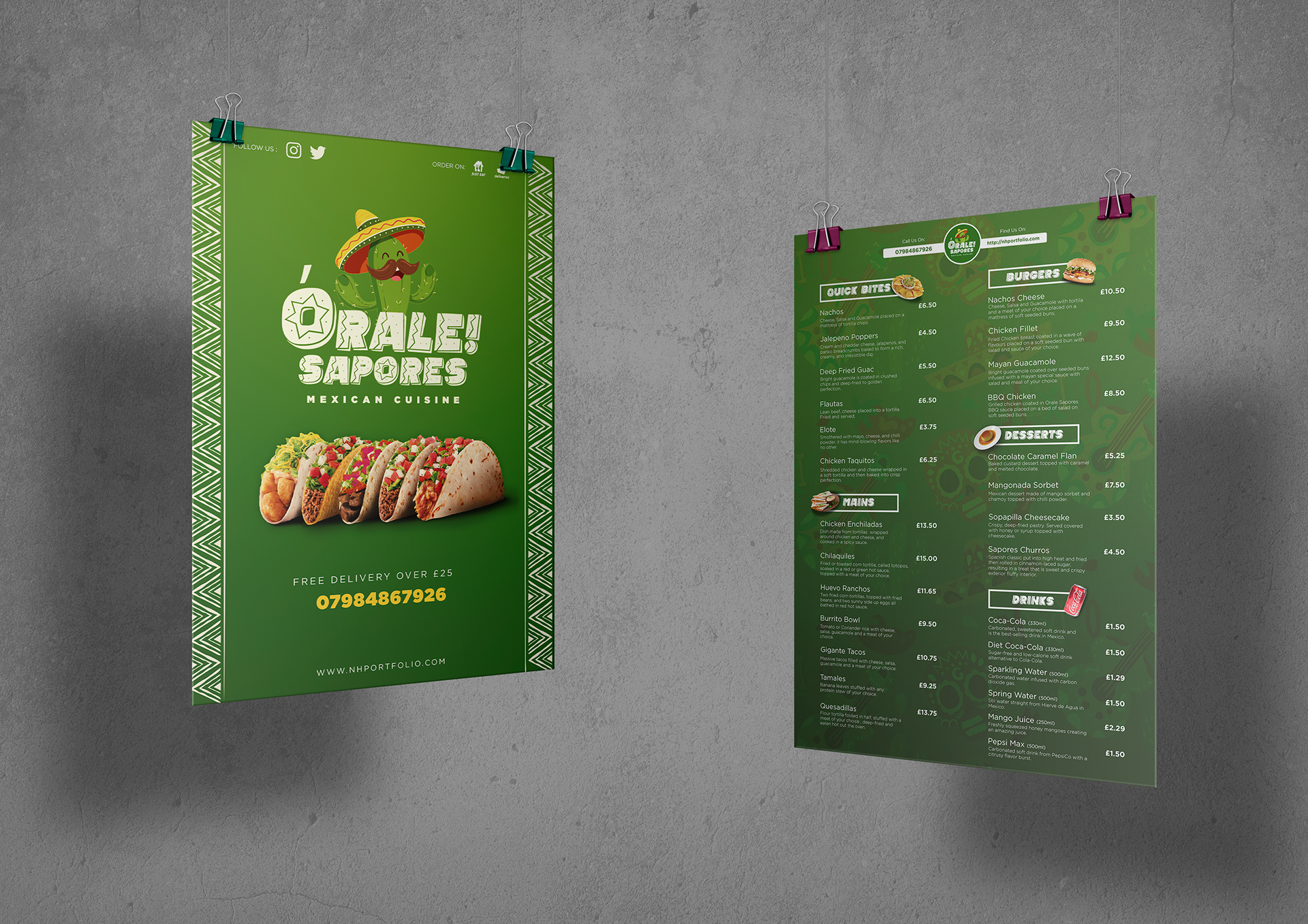
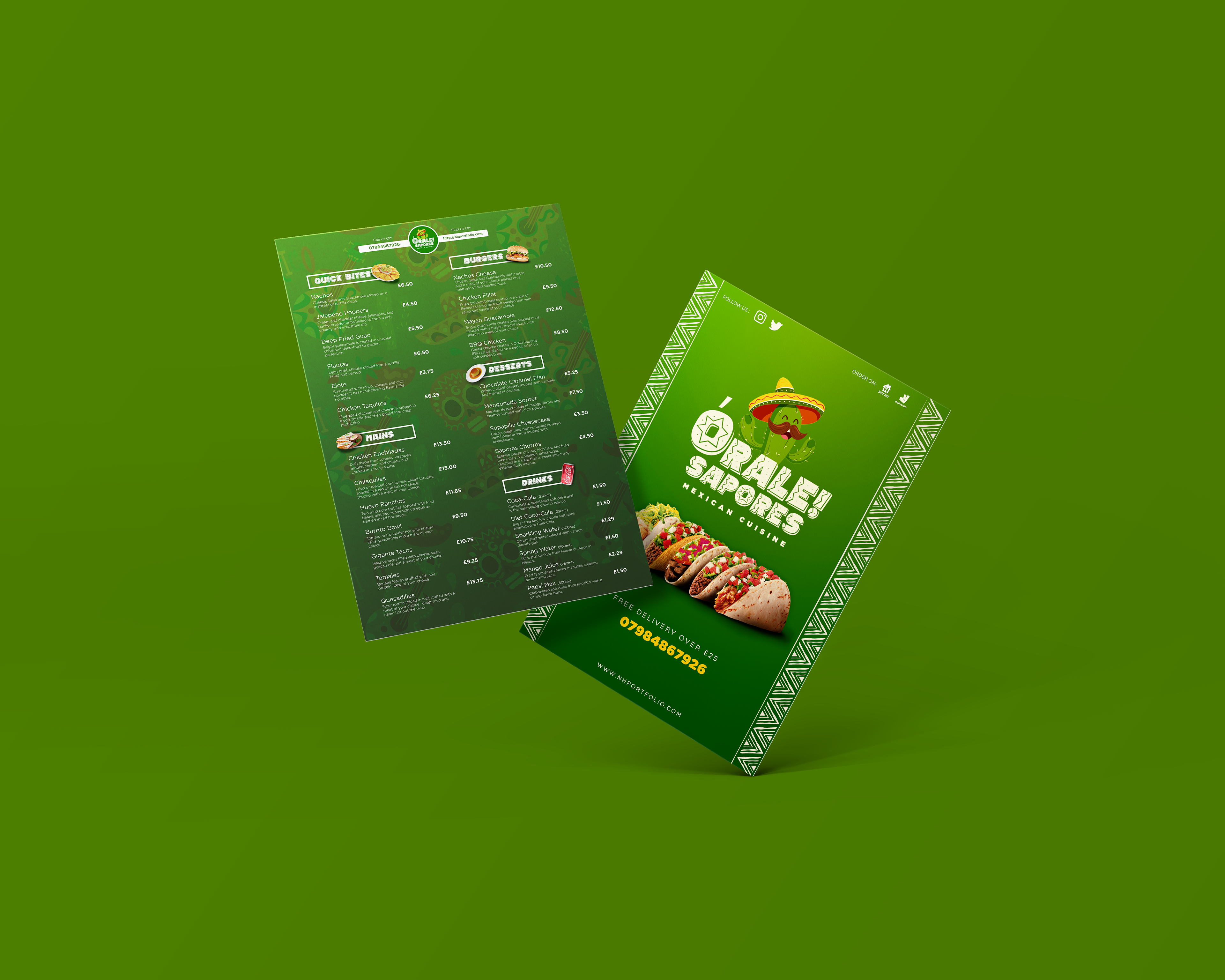
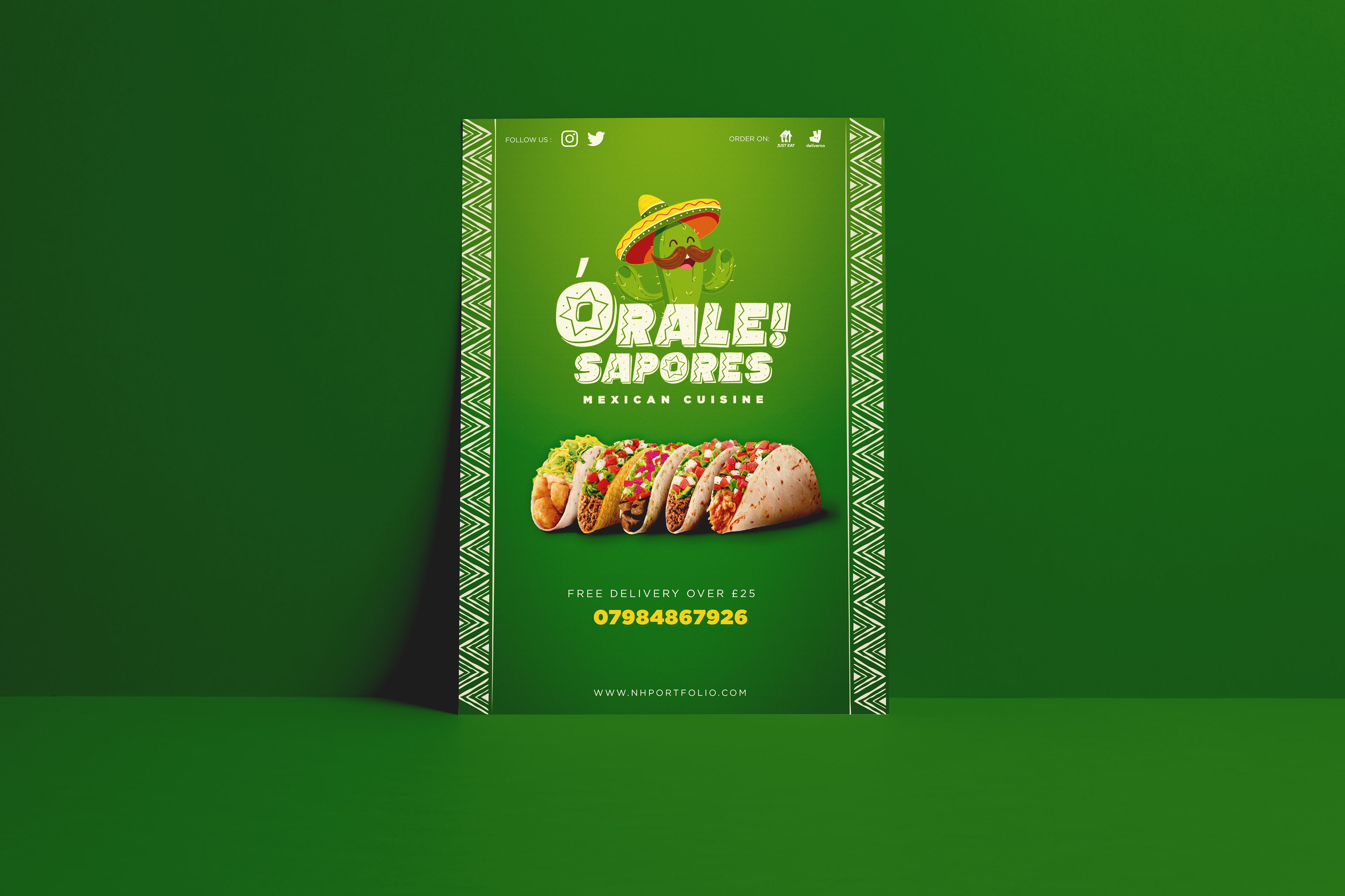
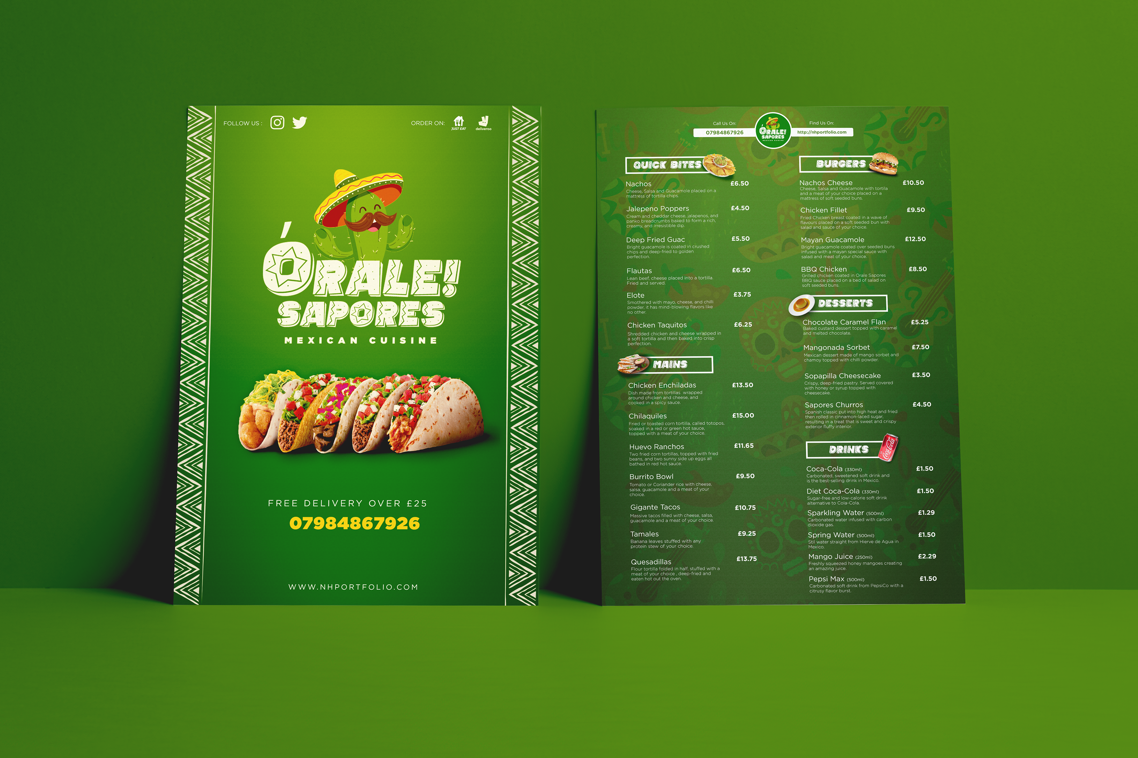
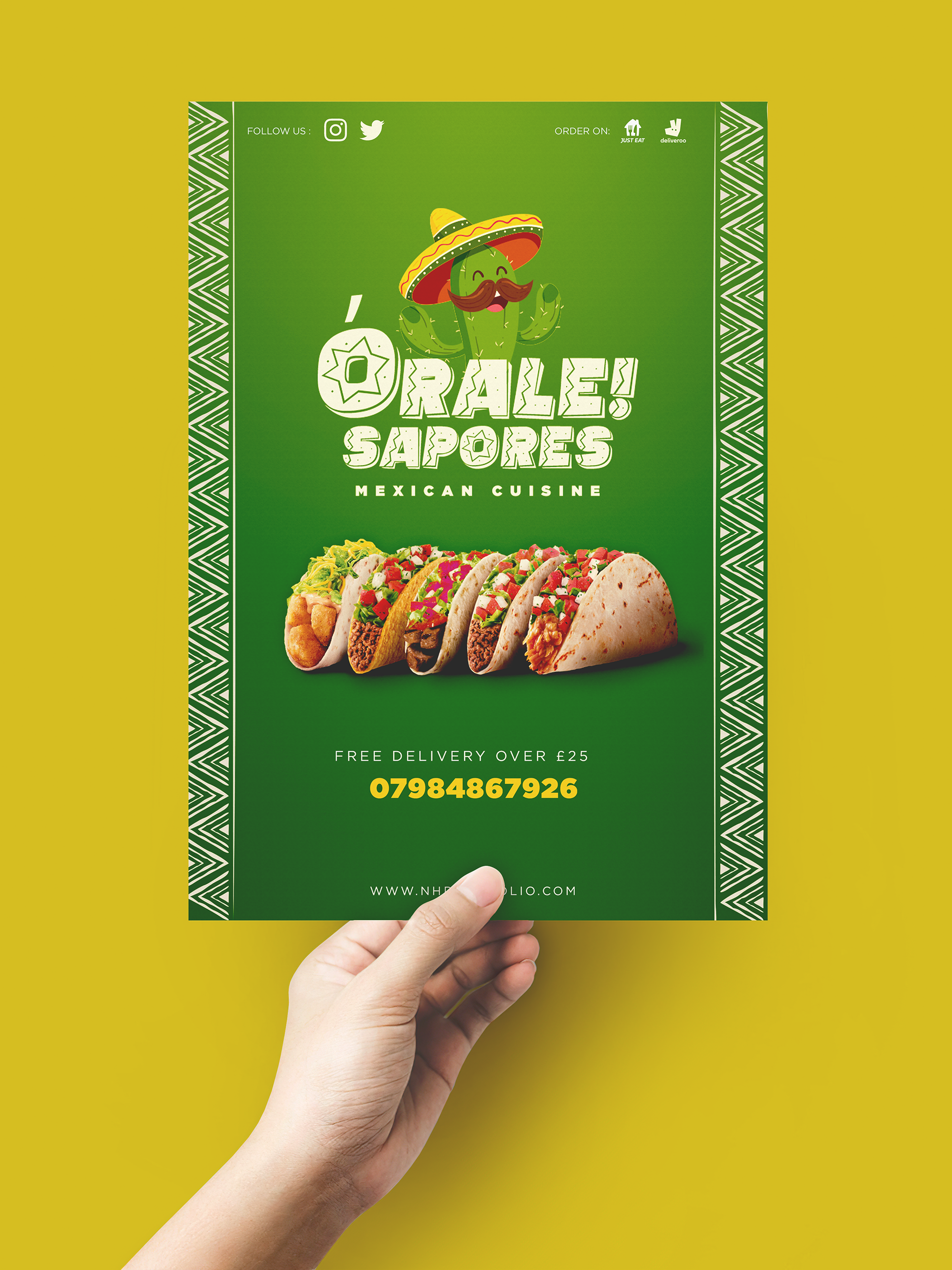
The visual direction focuses on colour, personality, and cultural references. The front of the flyer places tacos at the centre of the composition to showcase the quality and appeal of the food, acting as a strong visual hook.
The name Órale! Sapores was chosen deliberately:
- Órale! is a Mexican expression meaning “amazing” or “approved”
- Sapores translates to “flavours”
Together, the name reflects excitement, taste, and celebration.
Together, the name reflects excitement, taste, and celebration.
Typography plays a key role in reinforcing tone. The Mexican Tequila typeface was selected to add character and cultural context, supported by playful illustration , including a smiling cactus with a sombrero and moustache which creates a friendly, inclusive personality.
Cultural Details & Design Elements
To strengthen the Mexican identity of the design, Aztec and Mayan-inspired borders were used on the front, while the back incorporates iconography referencing Mexican culture and events such as Cinco de Mayo.
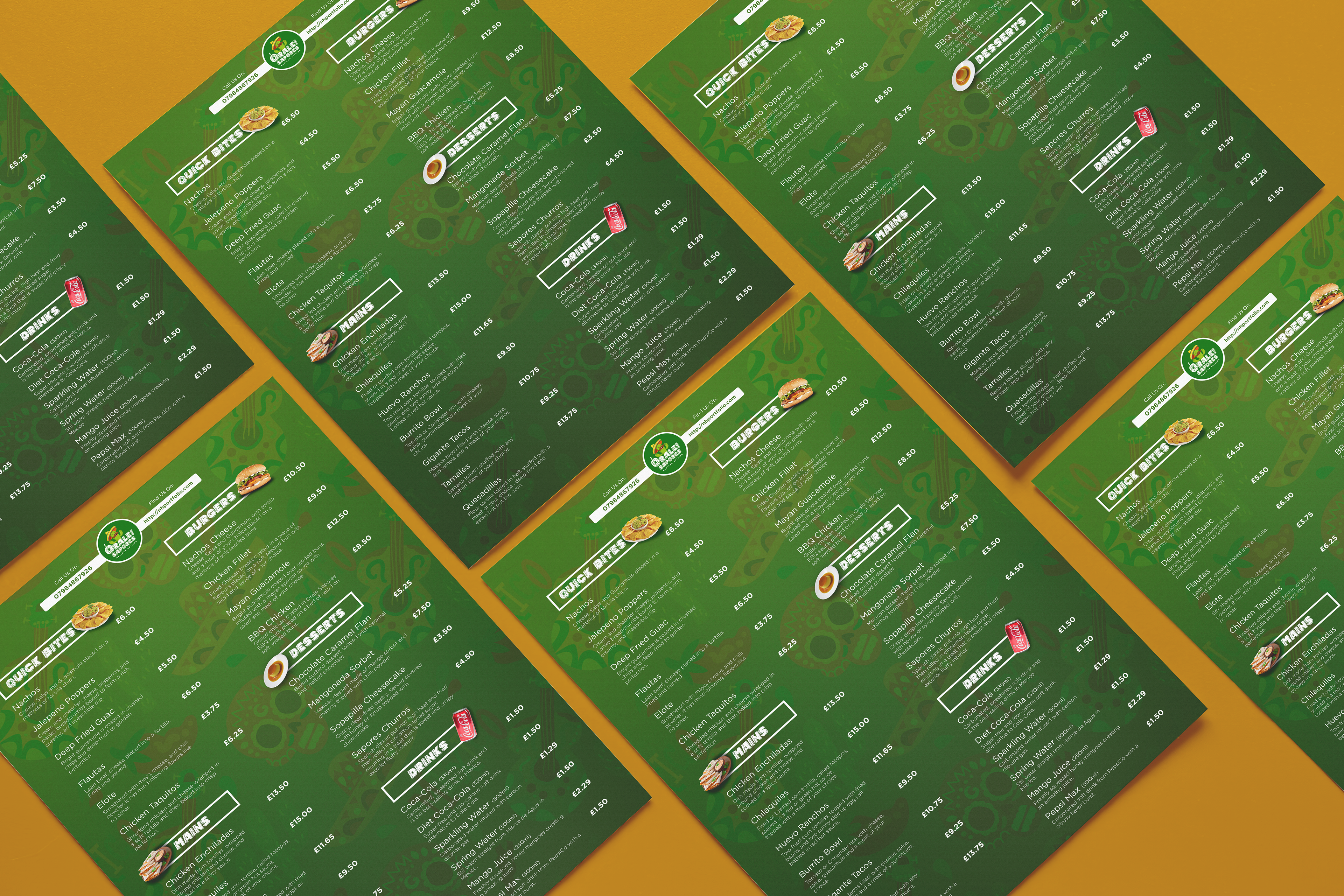
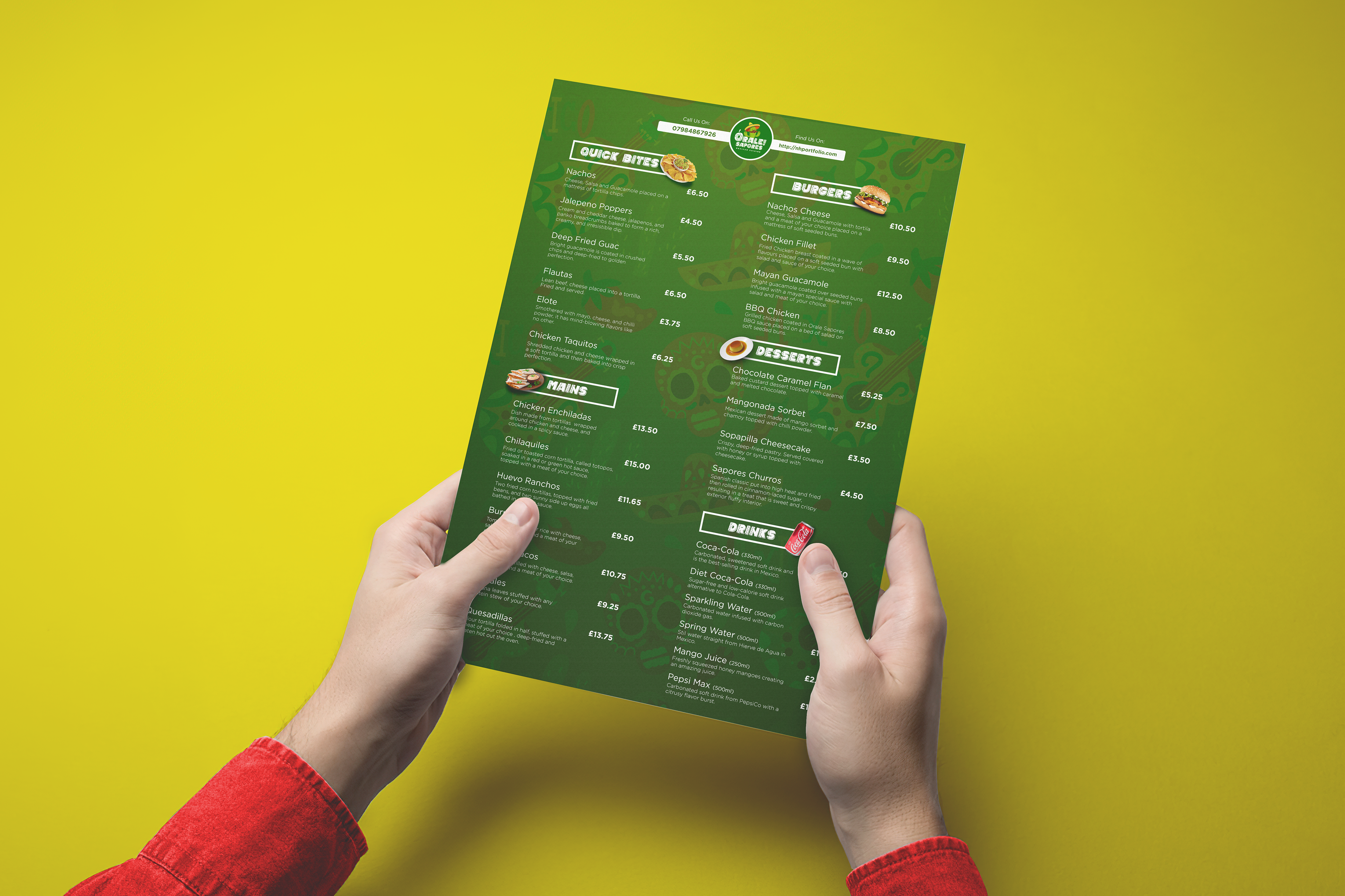
The menu features a mix of traditional Mexican dishes and items commonly found in the UK, including:
- Tacos and Nachos
- Elote and Enchiladas
- BBQ Chicken Burgers
This combination reflects the restaurant’s aim to appeal to both traditional food lovers and a broader audience.
Outcome & Learnings
Through this project, I:
- Explored how colour and illustration can communicate flavour and energy.
- Strengthened my understanding of culturally driven visual identity.
- Developed confidence in using expressive typography without losing clarity.
This project reinforced the importance of tone, storytelling, and visual warmth when designing food-led branding.