Project Overview
This personal project explores the design of a cross-platform music streaming application for desktop, tablet, and mobile devices. Inspired by platforms such as Spotify, Apple Music, and Audiomack, the aim was to design an intuitive and visually distinctive music experience focused on discovery and personalisation.
The application, titled Soundwave, is built around the idea that music is formed through rhythm, beats, and waves , making the name both relevant and memorable.
Objective
Soundwave is designed for music lovers who want to discover, revisit, and organise music across all genres and cultures, from mainstream releases to global and emerging sounds.
The goal was to create a platform that:
- Encourages music discovery
- Allows users to curate and share playlists
- Feels calm, immersive, and modern across devices
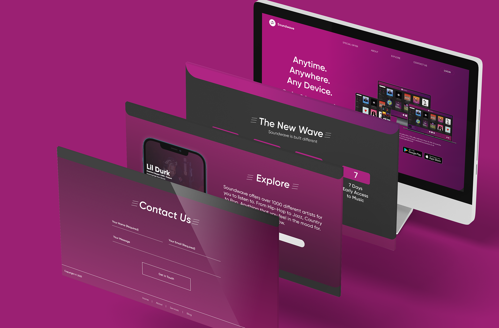
To differentiate Soundwave from existing platforms, the app introduces a subscription feature that allows users to follow artists and access new releases up to seven days early.
Concept & Visual Approach
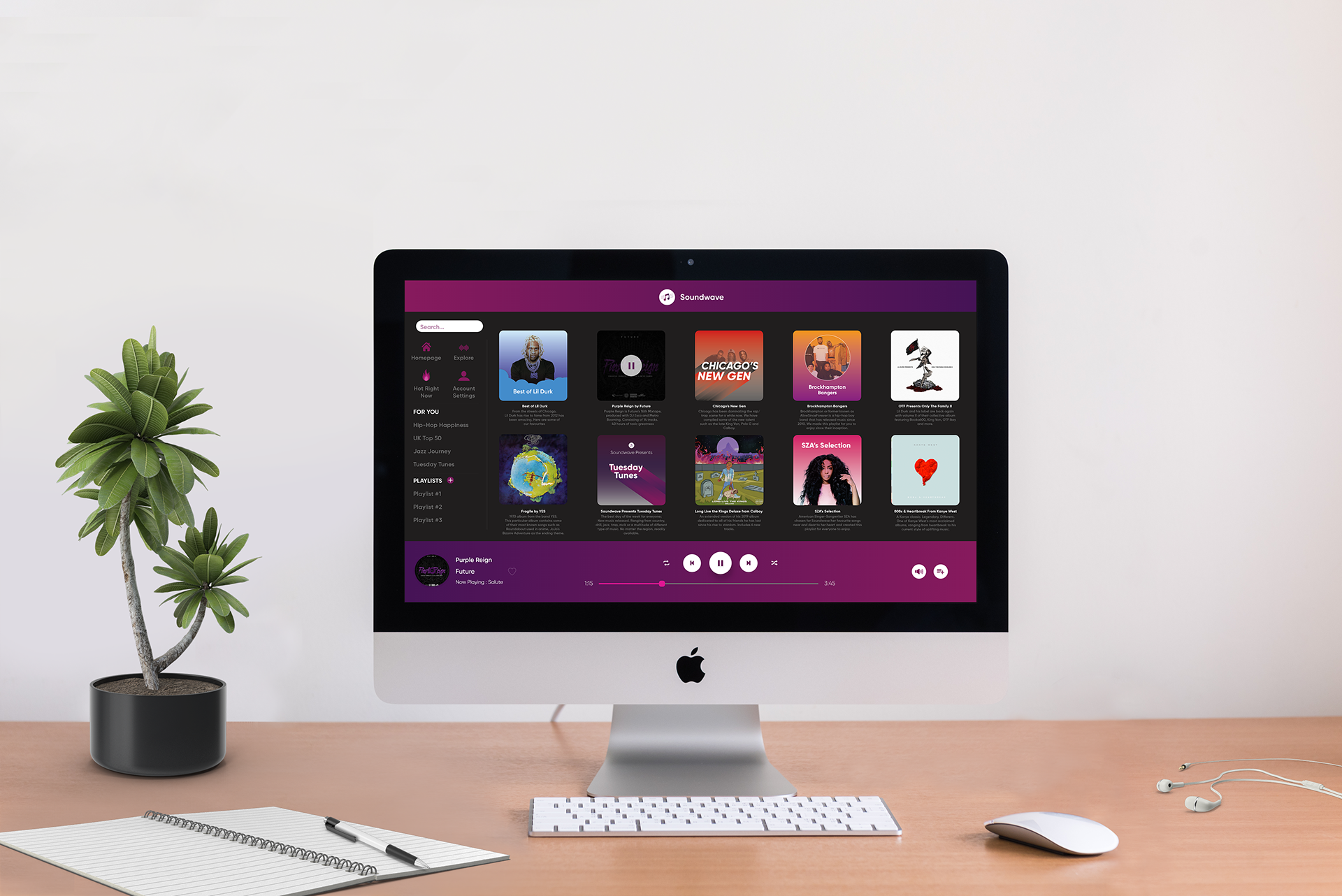
The visual identity is built around a pink and purple colour palette, chosen for its contrast while maintaining a calm, atmospheric tone suited to long listening sessions.
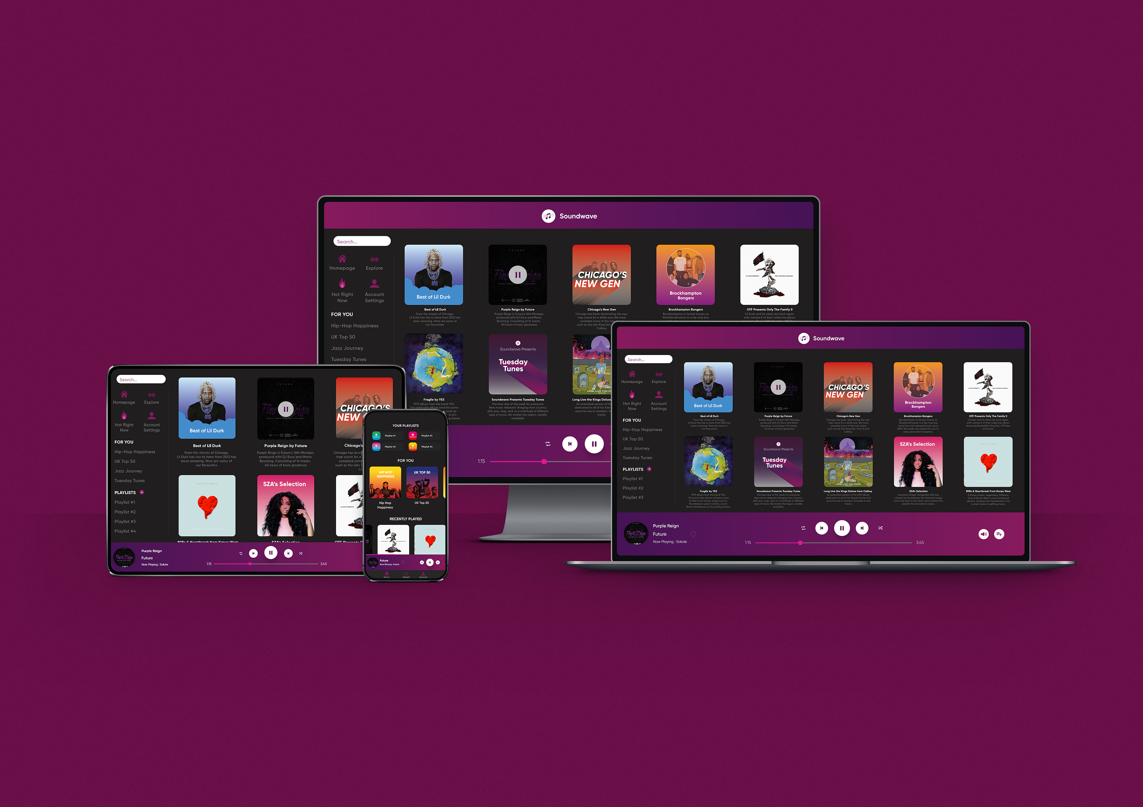
The interface adapts to different devices while maintaining a consistent core experience:
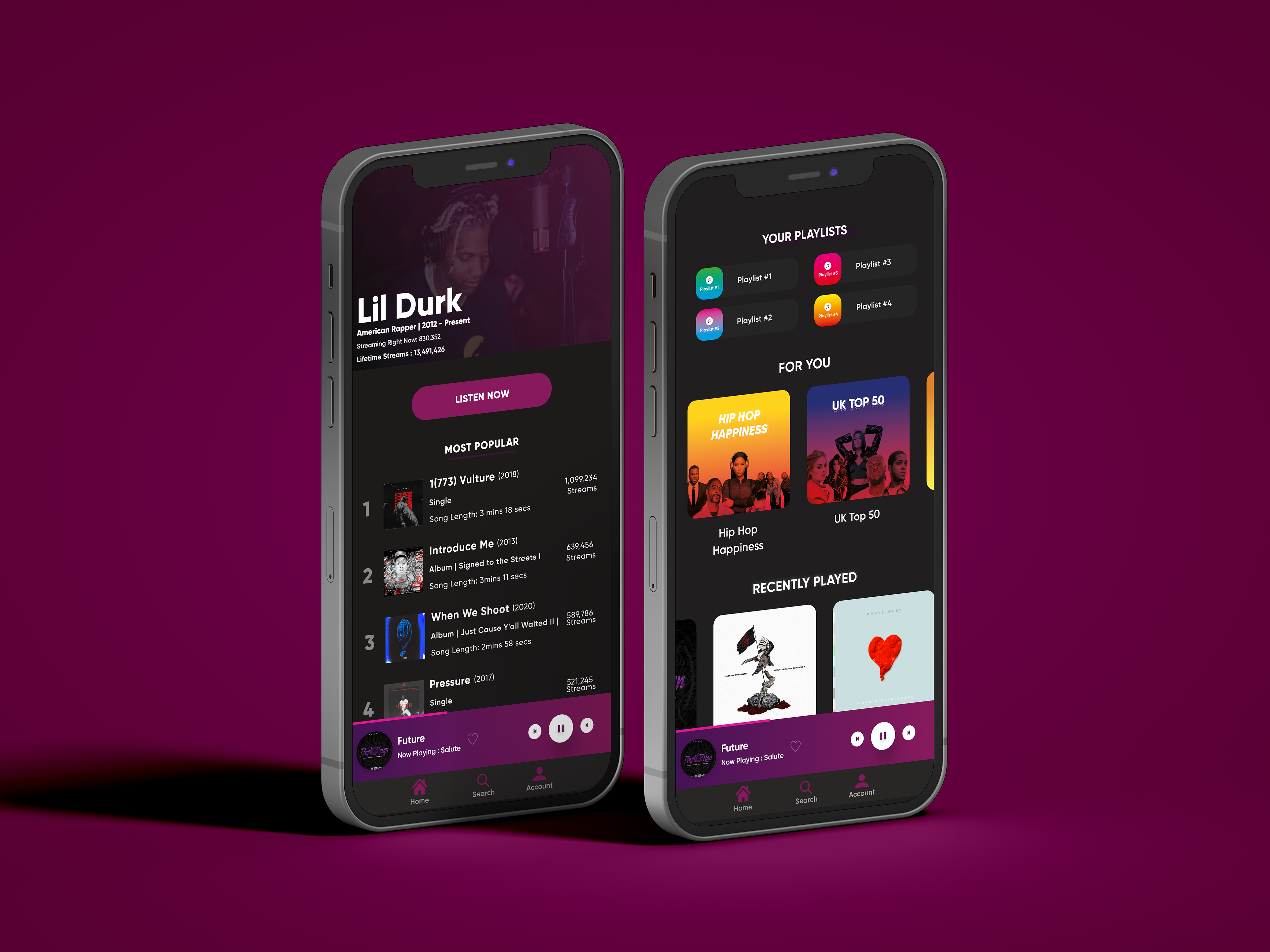
- Desktop & iPad display up to 10 recently played titles on sign-in, allowing users to quickly resume listening.
- Mobile prioritises playlists, recently played tracks, and personalised recommendations in a compact, scroll-friendly layout.
Across all platforms, the music player follows a consistent template. Album artwork is displayed within a rotating disc that spins continuously throughout playback, reinforcing the idea of rhythm and flow. The progress bar gradually fills with pink as the track plays, visually tying interaction back to the Soundwave brand.
Interaction & UX Details
Artist discovery is visually highlighted within the interface. Artists who have released new music are shown with a purple circular indicator around their profile image, allowing users to quickly identify fresh content without relying on text alone.
This visual cue encourages exploration while keeping the interface clean and uncluttered.
Outcome & Learnings
Through this project, I:
Developed a stronger understanding of cross-platform UI consistency
Explored how colour and motion can enhance immersion without overwhelming the user
Improved my ability to design feature-led interfaces that balance discovery, usability, and brand identity
This project strengthened my approach to designing scalable digital products that adapt across devices while maintaining a cohesive user experience.
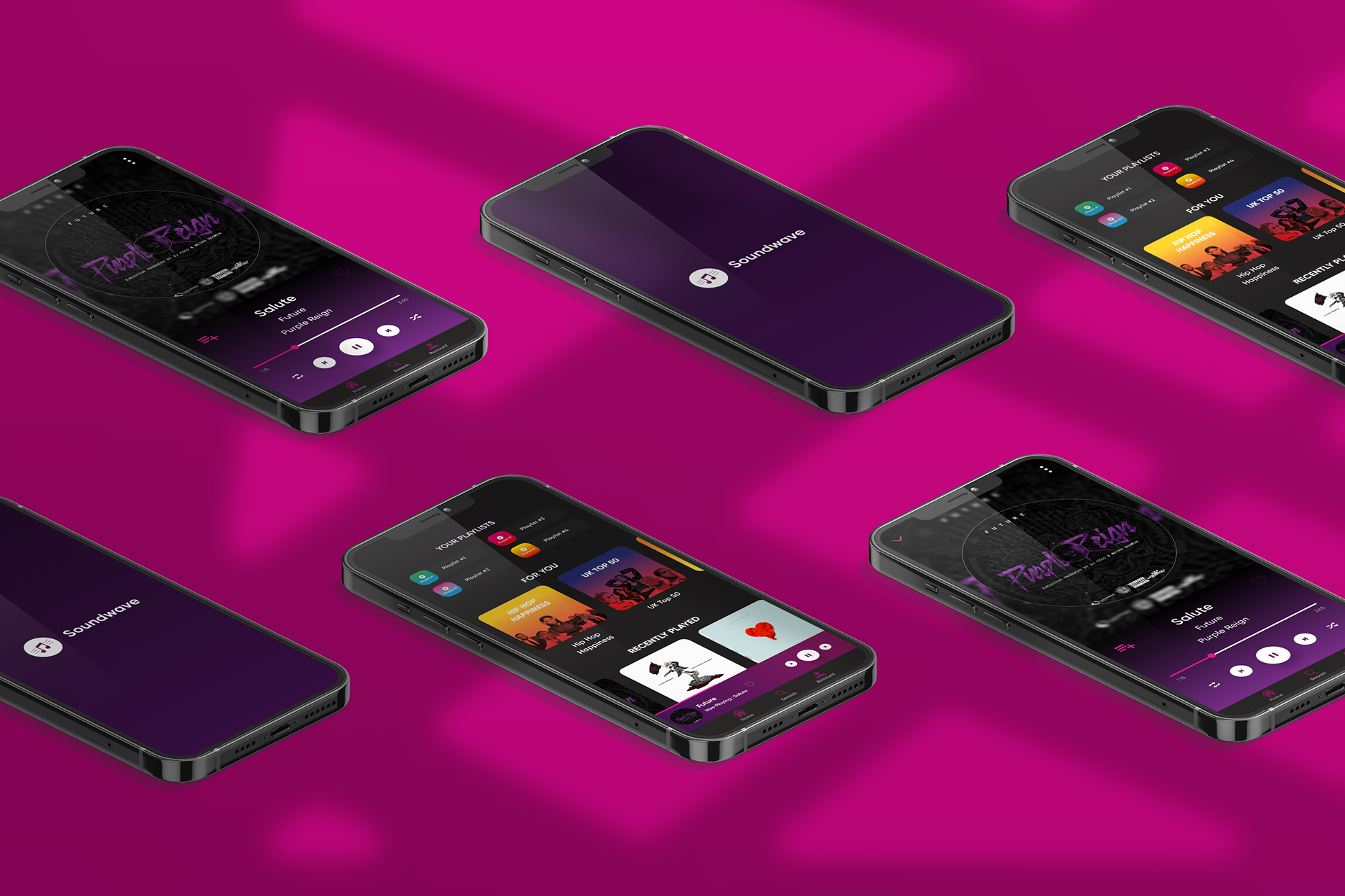
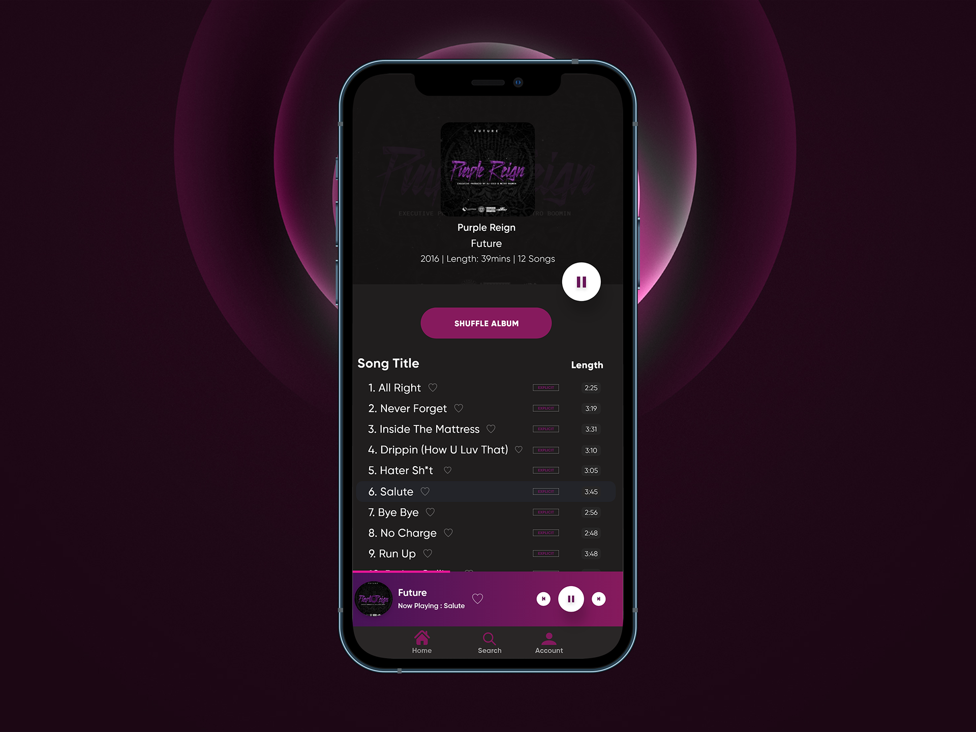
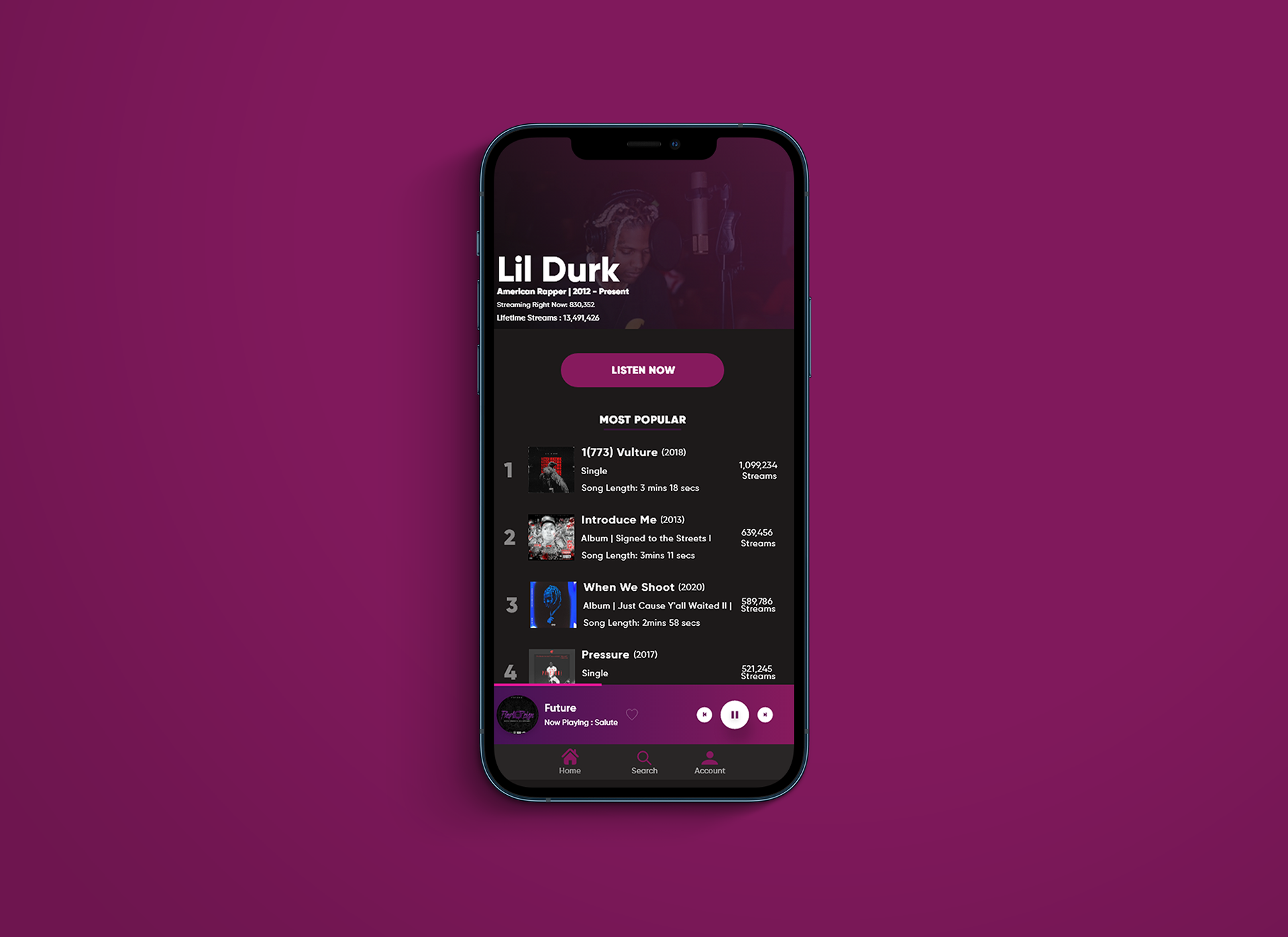
SOUNDWAVE MOBILE PROTOTYPE