Project Overview
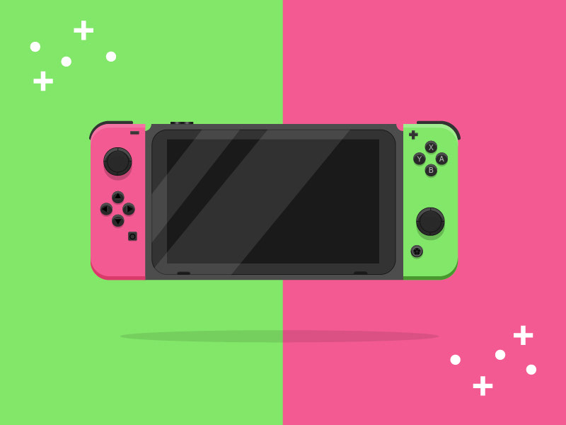
This personal project was created during the lockdown period as an opportunity to explore vector-based product illustration. Using Adobe Illustrator, I designed a stylised Nintendo Switch entirely with vector graphics.
The aim was to focus on form, colour, and simplicity rather than realism.
Objective
The objective was to create a bold, visually striking representation of the console using single, flat colours, drawing inspiration from pop art and minimalist design.
I also wanted the design to feel contemporary and reflective of the different Switch models and colour variations available at the time.
Research & Visual Approach
To inform the design, I researched a range of video game aesthetics and minimalist user interfaces, which have become increasingly prominent in modern digital and product design.
Using this research, I constructed a simplified, pop art–influenced version of the console, focusing on clean shapes, strong contrast, and visual clarity rather than surface detail.
Creative Decision
The original concept focused solely on exploring alternate Joy-Con colour combinations against different background colours. During development, I expanded the idea by introducing white circular and plus-shaped elements into the composition.
These shapes reference the physical buttons of the console and were added to create a greater sense of immersion and visual rhythm, helping the illustration feel more dynamic rather than static.
Outcome & Learnings
Through this project, I:
-Strengthened my vector illustration skills in Adobe Illustrator.
-Improved my ability to simplify complex objects into clear, readable forms.
-Explored how colour, repetition, and shape can be used to add energy without relying on texture or detail.
This project reinforced the importance of restraint and clarity when designing minimalist, graphic-led visuals.